CONTEXT
During my full time User Experience Design course at BrainStation I was paired up with a partner and given a design challenge to redesign a current mobile application (of our choice) using the 10 usability heuristics for design. We identified a specific task within the app and selected five heuristics to evaluate the usability. Based on our findings, we worked together to create solutions via sketching, wireframing and finally, designing high-fidelity screens - ensuring our design solutions matched the existing brand and UI components as closely as possible.
Timeline:
5 Days
Team:
Caitlyn
Nick
My Role:
Heuristic evaluation
Inspiration
Sketching
Lo-fi wireframing
Presentation planning

PROCESS
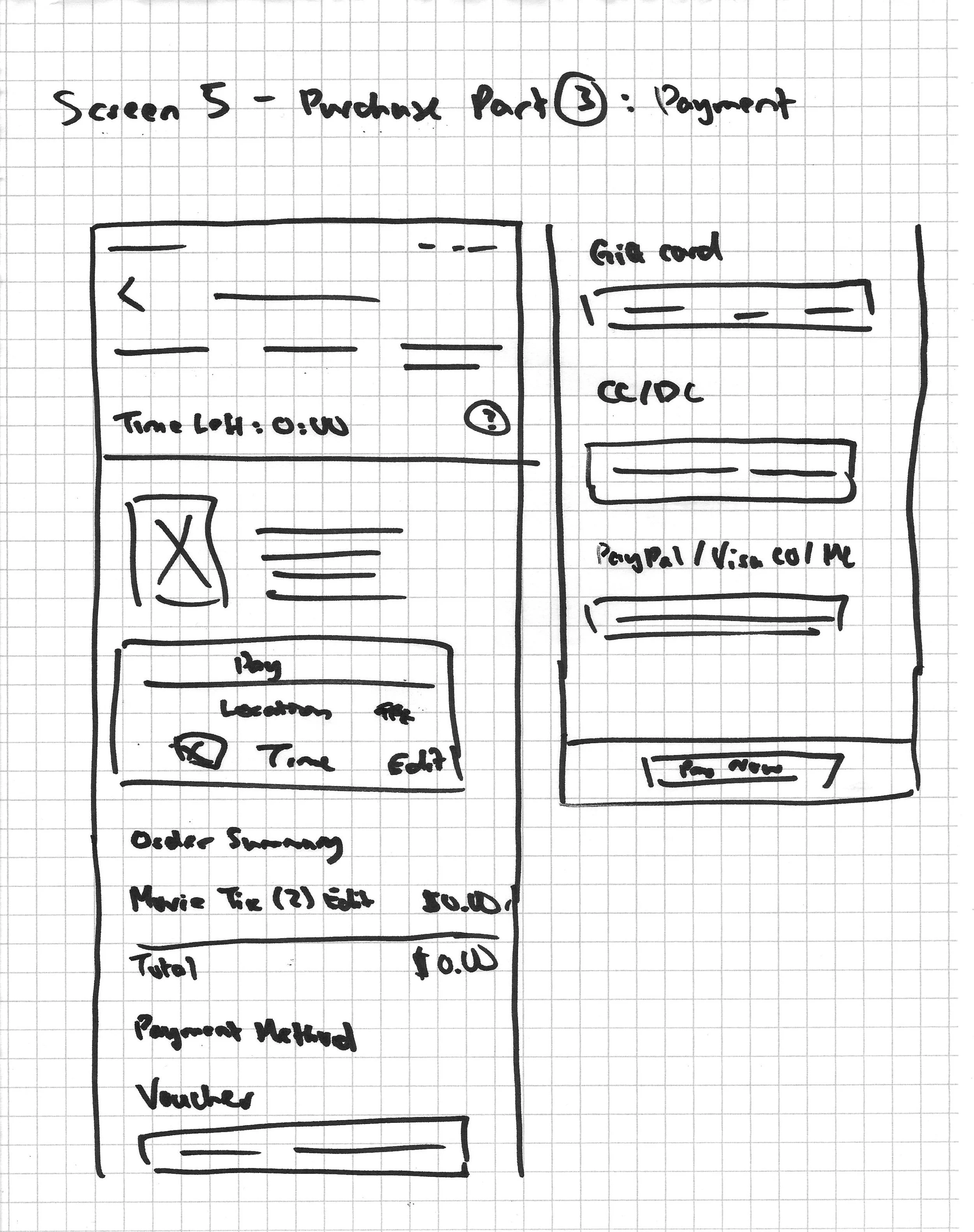
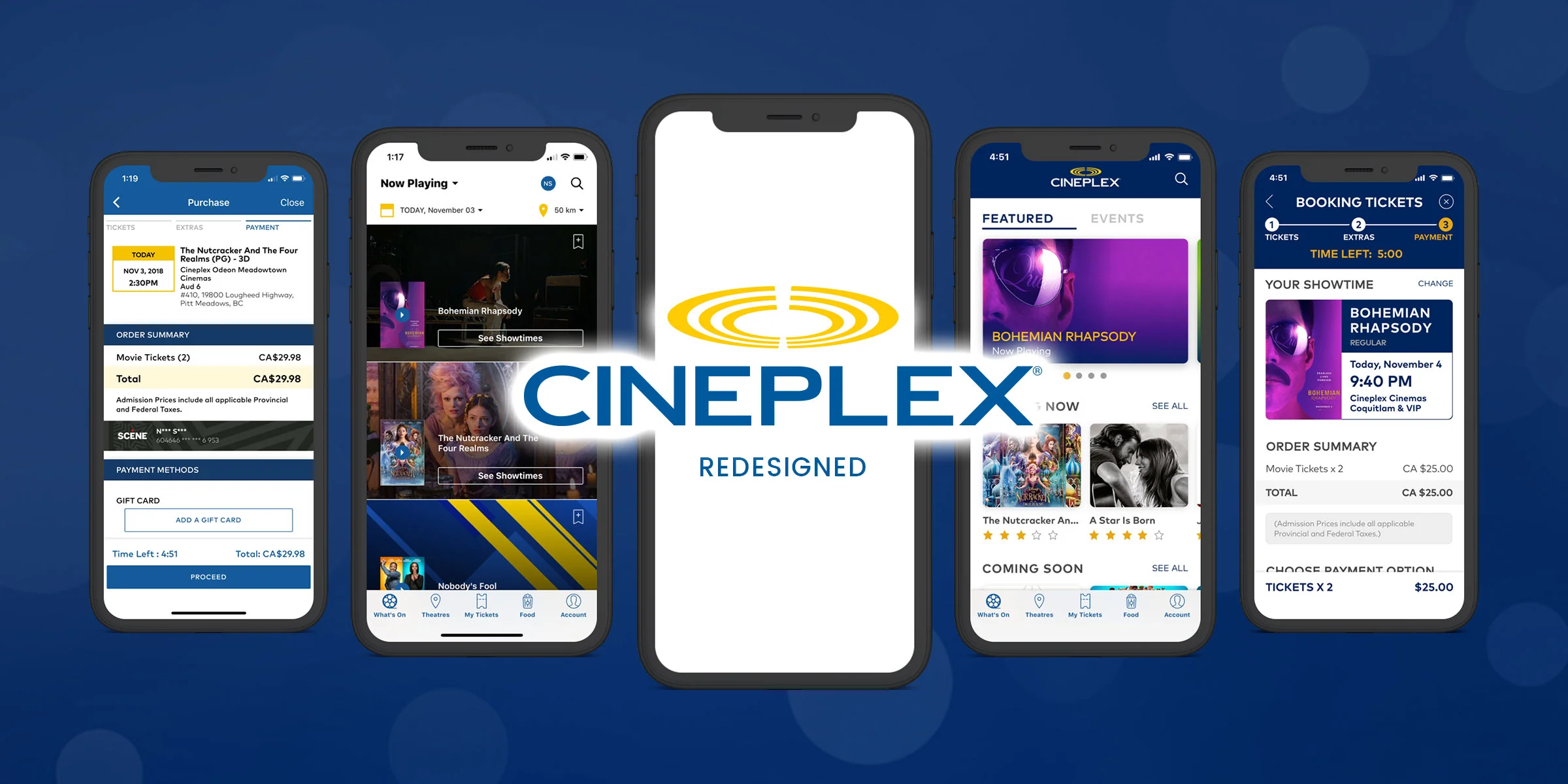
Choosing a Task
Selecting a movie and purchasing tickets.